
Tuesday, September 18, 2012
Friday, September 7, 2012
Viscomm Blog Post
http://spyrestudios.com/minimalist-icon-symbol-pictogram-sets/
This website has some cool logos and icons! Inspires me to create bolder and more graphical designs for my hummingbirds.
This website has some cool logos and icons! Inspires me to create bolder and more graphical designs for my hummingbirds.
Type I Post #3: Good Book cover design
 This is one of the additional examples that caught my eye. I was drawn to this because the title has been sort of incorporated into the first paragraph, and I also love how it has been emphasized with the red color.
 Book cover with futura font. This drew me in because of the vertical titles and names, size contrasts, and the slight spacing in between the letters. Also it's really nice how the quote is perfectly fitted within the neck of the bird, creating additional movement to the up and down variations of the titles and author's name.
  Obviously, this futura font cover attracted me because of the boldness of its letters. I was attracted to the contrast between black and white and diagonal of the authors name and "A Novel." Overall I am a big fan of boldness and I think that this book cover definitely conveys that pop of bold attraction.
  Futura typeface- I really really like the flowiness of the text and the contrast between bold and all caps, italics, and roman.
  Didot is the typeface used for this cover. I think it's neat how the words go diagonally, and the sizes of the typefaces vary. Also I love how the title is highlighted in black and the other words are contrasted in red. In addition, there's words that go vertically down the cover, and i think it's a nice touch too.
 This cover was really neat to me. I like how the ends of the letters within the futura font become illustrations, yet the type is still the main focus of this cover. I like also the asymmetry that the title and the author's name creates, because it makes for smooth movement down the entity of the cover.
 I think that this futura font cover is really awesome for its simplicity, yet boldness. The contrast between the black and white is classy, simple, and clean. I love also how the other little elements border the boldness of the "Beckett." This shows how you can make something simple yet eye-catching at the same time.
 This is a cover using the didot typeface. It struck me because it has a clear sense of hierarchy within its title. Also, I like how the title is not capitalized, and the second part is all capitalized creating a nice balance and visual interest.
  Simple, yet effective. This cover uses very few elements and it also has a clear hierarchy. I like the lightness of the typeface and the light feel: also the eye is drawn into a curved motion around this cover.
  LOVE the asymmetrical/ curved placements of all the different text elements, and the hints of red!
 This futura font example of a book cover is interesting and i love the different weights of the typefaces. In addition I like the contrast of the vertical and horizontal line arrangements, and the way my eye moves from the left to the right.
  I love the integration of text and images!
 Another didot cover composition. I like the spacing of the letters and the lightness of the typeface! In addition, I am in favor of the subtle splashes of color. This cover also uses a very clear hierarchy and interesting text variations.
  This would be a cool idea for one of my new compositions. The broken up and blown up letters/ words really inspire me to do something like this similar for my project. It's definitely an abstraction and a new way of looking at how to make art with type.
  I fell in love with this bold text and size variations. I think this is interesting and would make for another cool idea for one of my new layouts.
Monday, August 27, 2012
Latest artwork

Drawing for my friend Matt. This will go on website for his new and "growing" record label.

Jayhawk painting ! Acrylic.
Hummingbird drawing project
Check out this site--------> http://www.hummingbirdsociety.org/index.php (It's where I found information about those beautiful hummingbirds)!
Such a crazy song these hummingbirds have------> http://www.youtube.com/watch?v=Vm9ME7jVRuY
Also, I found some very useful steps below that will help me with this project, especially with the one line drawings.
How To Draw a Hummingbird
How To Draw a Hummingbird


In this drawing lesson we’ll show you how to draw a Hummingbird in 8 easy steps. This Free step by step lesson progressively builds upon each previous step until you get to the final rendering of the Hummingbird.
This is a simple lesson designed for beginners and kids with real easy to follow steps. Feel free to print this page and use as a drawing tutorial.
Here are some fun facts about the Hummingbird you might find interesting.
- They are among the smallest of birds.
- They can hover in mid-air by rapidly flapping their wings 12–90 times per second.
- They can also fly backwards.
- They can fly at speeds exceeding 15 m/s.
- Hummingbirds drink nectar, a sweet liquid inside flowers.
Step 1: Begin by drawing the back of the head.

Step 2: Draw the beak.

Step 3: Draw the lower body and neck.

Step 4: Draw the first wing.

Step 5: Draw the lower feathers.

Step 6: Complete the lower feathers and add the wing details.

Step 7: Add more wing details.

Step 8: Finish by adding the eyes and the beak details to complete the drawing of the Hummingbird.

This is a very short video on drawing a HummingBird, the process isn’t exactly clear but its worth a look to see what shapes are being used to draw the Hummingbird.
 It's a work in progress!!
 It's a work in progress!!
Type I Post #1: Asymmetry Project
These photos were taken all on campus! : )

The chancellor's greenhouse in my opinion is a perfect use of asymmetry because of the different heights of horizontals within the windows. The variations of the tall and shorter window lines give this image an asymmetrical effect and create a varied up and down movement for the eye.
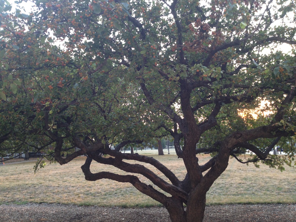
The longer branches of this tree first draws the eye to the lower left and then it is drawn to the upper right branches of the tree. I like this photo because it creates movement, and there are varied lengths of the short and long branches to create the off-balanced look.

This side view of the chancellor's house is very geometric, and the silhouette of the roof's shapes create asymmetry. It switches off from the medium sized chimney to the short, curved window and then the eye heightens to the pointed tip of the roof on the right. Although these are different shapes, it still makes the eye move down and up from the left to the right .

These rods are from a construction worksite on a building near the Union. Although slightly on a diagonal, I found that the rods truly created asymmetry through their varied heights. Also, I liked how the rods on the left were placed closer together than the far two rods on the right side. I found this to be a unique snapshot of asymmetry through just straight lines.

Snow Hall across from the design building shows asymmetry through yet another silhouette of a rooftop. Similar to the chancellor's house, the shorter and taller shapes create the imbalanced, up and down movements. Also, the close placement of the two features on the right off sets the shorter and farther away pointed part of the building.

Again, I like how this tree too creates asymmetry through its branches. The varying short and long horizontal branches and puffs of green pine leaves draws the eye up the tree to create a nice flow of left and right movements.
Thursday, December 8, 2011


Subscribe to:
Comments (Atom)