Wednesday, September 28, 2011
Monday, September 26, 2011
Interviews about the spoon!
Interview questions for the Spoon/Fork/Knife Combo
Interviewed: Brady, 19 yr old
1. How many times a day/ per week do you wash dishes? 1 or 2 times per day
2. How long does it take you to set a table on average? 8 minutes
3. Do you find yourself feeling uncomfortable when you hold this spoon? yes
4. Are your kitchen drawers typically cluttered with silverware? For the most part, organized
5. Do you run out of specific utensils easily? Forks
6. How often do you get up from the table to grab a specific utensil that you forgot? Not often
7. What was your favorite silverware set/ dining utensil and why? Smaller fork, to eat easier
8. Do you find yourself cutting your food more often with a fork or a knife, or both equally? Cutting with a fork
9. What do you think is a positive quality about the metal spoon? The concave part of the spoon
10. What could be improved about this metal spoon? Make it more lightweight
11. What do you think about adding a fork and a knife to the spoon? For some meals yes, and for some meals unnecessary.
a
Interviewed: Naomi, 18 yr old
1. How many times a day/ per week do you wash dishes? Once a day
2. How long does it take you to set a table on average? 5 minutes
3. Do you find yourself feeling uncomfortable when you hold this spoon? Moderately uncomfortable
4. Are your kitchen drawers typically cluttered with silverware? Organized
5. Do you run out of specific utensils easily? Regular spoons
6. How often do you get up from the table to grab a specific utensil that you forgot? Not often
7. What was your favorite silverware set/ dining utensil and why? The fork, because it’s versatile
8. Do you find yourself cutting your food more often with a fork or a knife, or both equally? Both equally
9. What do you think is a positive quality about the metal spoon? It’s all purpose
10. What could be improved about this metal spoon? It’s weight
11. What do you think about adding a fork and a knife onto the spoon? A great idea, because you can eat with using only one utensil.
Interview questions for the Spoon/Fork/Knife Combo with Andrew, 19 yrs old
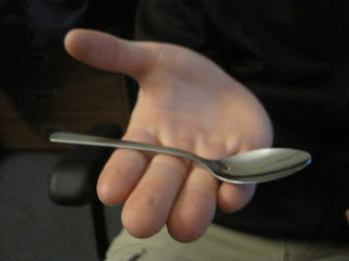
Good old Mr. Shirling, testing out the metal spoon.
1. How many times a day/ per week do you wash dishes? Two times a day
2. How long does it take you to set a table on average? Five minutes
3. Do you find yourself feeling uncomfortable when you hold this spoon? Yes, moderately uncomfortable.
4. Are your kitchen drawers typically cluttered with silverware? No, we are very organized.
5. Do you run out of specific utensils easily? Run out of forks.
6. How often do you get up from the table to grab a specific utensil that you forgot? Once a week, not very often.
7. What was your favorite silverware set/ dining utensil and why? A fork, because it can accomplish everything almost: it can cut, pierce, scoop, and can do everything a utensil should be able to do. (with the exception of liquids).
8. Do you find yourself cutting your food more often with a fork or a knife, or both equally? Mostly cut with a fork, except for steak and chicken.
9. What do you think is a positive quality about the metal spoon? It is good for withdrawing more product from the utensil.
10. What could be improved about this metal spoon? The spoon needs to be more concave, but the handle needs to be more proportional.
11. What do you think about adding a fork and a knife onto the spoon? I think it’s doing too much. The knife edge is not necessary for the side, because there is too much going on for the one utensil.
Sunday, September 25, 2011
Thursday, September 22, 2011
Tuesday, September 20, 2011
Thursday, September 15, 2011
Tuesday, September 13, 2011
Thursday, September 8, 2011
Wednesday, September 7, 2011
Why the black heel has good design
Most everyone in the world wakes up in the morning, and puts on a pair of shoes before they embark on their daily adventures. People wear a certain type of shoe for different reasons, such as comfort or style. As mentioned in the Dieter Rams article, the design should be useful, yet beautiful on the exterior. My black heel has good design for its sleek and professional look, yet it’s ability to be worn for extensive periods of time. Another great design quality of the shoe is that when the wearer puts on the heel, they feel powerful and in control (a point made by the Don Norman video). Also, they feel in control when the shoe is easy to understand how to attach and remove. Overall, the design of the shoe is simple, yet has lots of aesthetic value.
Response to Reading 01
Reading 01:
These pages from the three introductions in the books encompass intriguing insights to design. Design is the crux of human activity, and without it the needs of humanity would not be fulfilled. Design truly affects the daily function in our lives, whether it be through appliances that we use or means of transportation. It has so many complexities and meanings similar to the word “love”, ranging from the design of a chair, the department of fashion design, to an airplane or car designer. As explained from the third book, “design is a mix of creativity and analytical reasoning.” From these three introductions to design, I learned that design truly is a way to problem solve for humanity’s complexities. Through design trial and error, solutions can be found to enhance the necessities in our lives. For example, one of the objects I chose was a tape measure. The tape measure is a beneficial design versus the ruler, for it extends and then shrinks down to a minimal size for storage. The problem of a stable ruler not being able to extend when measuring can be solved by the extendable metal strip. This pertains to my major, illustration, because there will be problems I will encounter dealing with animation or even character construction. There are going to be software encounters that I may not know how to deal with, but through determination, trial, and error, the struggle will become nonexistent and a solution will be found.
Tuesday, September 6, 2011
My 6 Favorite Fancy Shoe Sketches (With 5 descriptions)
The Shoe
The successes of this drawing are shown through the interesting point of view of the shoe. Rather than from the side, the view is from the back, with graphite values and eraser marks. This communicates to the viewer a mystery, because the frontal part of the shoe is not shown. Also, it communicates realism through realistic value and shadowing.
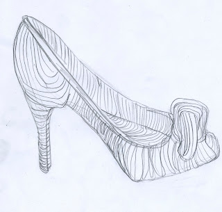
This drawing is successful because it clearly defines the roundness of the shoe through cross contour lines and very simple design. The curvy lines show the waves and edges of the shoe's design. It also has great composition with proportional components. It communicates simplicity and solid form to the viewer.
This shoe drawing is successful because it shows the details from the buckle of the shoe. The crosshatching in the shadows emphasize the darks and lights, and gives the shoe a stylized sense of form. This picture communicates beauty, because it focuses on the intricate detail rather than the image as a whole.
This drawing is successful because it clearly shows the shape of the shoe design through defined contour lines, and correct proportions as well. It has a blueprint-like quality, which helps the viewer instantly know what the drawing of the object is. This sketch communicates simplicity, good design, and clearness to its viewers.
This drawing is successful because it provides an accurate yet energized depiction of the front of the shoe. By combining both elements of a gestural line and a contour line, the form of the shoe shows even without use of value or shading. This shoe drawing communicates a gestural type of drawing, reflecting movement and energetic life within the shoe.
Saturday, September 3, 2011
Thursday, September 1, 2011
Response to "Objectified"
Samantha Levine
8/31/11
Response to “Objectified”
Directly after watching the documentary Gary Hustwit’s “Objectified”, I began to look at objects from a brand new light and perspective. My new sense of design began when the opening scene of this documentary appeared with the careful manufacturing of a white, plastic chair. Each chair took time to make, and this truly taught me that most people do not even consider the time, dedication, thought, and aesthetics that go into one single object. Through this interesting and captivating documentary, I learned that designers are problem solvers, good designers stick within guidelines, and designers know how to make something beautiful, yet usable.
Good designers must be good problem solvers. For example, in one part of the documentary, it was talked about how people with arthritis used to have trouble using the older fashioned potato peelers because of their handles. But, through good designers and creative ideas, the new, modern potato peelers have a handle with the feel of a bike grip in order to make it easier to grip it for those people with arthritis. Just as smaller children find it easier to hold larger crayons, the same applies to the people with arthritis. Another example that was shown through the documentary was the invention of an easier-grip weed cutter. This weed cutter was re-designed to have dips in the handles to lock one’s grip into place so the hands won't slip when doing yard work. This documentary made me realize that design is helpful to society, and even the smallest of innovations or changes can help improve the simple things in life.
Not only are designers good problem solvers, but I also learned that they must make designs that are contained within certain criteria. Dieter Rams provides ten rules of good design, which includes simplicity, and durability. It dawned on me that good design must not be overdone, just like Apple’s products. Their products have very simple lines and shapes, and therefore its sleekness attracts positive attention. From this, I learned that an overly designed object trying too look flashy receives less attention than a design with a clean cut and simple look. Secondly, a good design is durable. Designs, as described in the documentary, should either last forever, or be disposable. If the design lasts for a time in between, then what is the point of the existence of the design? Therefore, every design should fall under the rules of Dieter Rams in order to be most successful.
Finally, designers know how to make objects beautiful, yet usable. For example, one of the designers in the documentary showed two types of vacuums: one was shaped like a cone, and the other was a normal Dyson vacuum seen in an average household. The one shaped like a cone could be seen on a mantle as a decoration, and not just a vacuum. Good design has a double purpose, and that is truly an element that I will always use for my future work. Through this documentary, I learned that design is more than just the creation of something. It’s about designers who are problem solvers, good designers who stick within guidelines, and designers who know how to make something beautiful, yet usable. From this outstanding documentary, I know now that creating an innovative design can truly change humanity and how we function.
Subscribe to:
Posts (Atom)


